Lighting Design
·
What Is CRI? Why Colour Rendering Matters More Than You Think
Learn what CRI (Colour Rendering Index) means, why it matters and why high-CRI lighting creates richer colours, better interiors and more beautiful spaces.

Have you ever bought clothing that looked perfect in a shop, only to find it looked completely different when you got home?
Or noticed that food, artwork or timber simply doesn’t look as vibrant under certain lights?
The reason often comes down to something called Colour Rendering Index, more commonly known as CRI.
While most people focus on brightness or colour temperature when choosing lighting, CRI is one of the most important factors in how accurately colours are seen. It’s the difference between lighting that simply illuminates a room and lighting that brings a space to life.
At Cobinlight, we believe understanding CRI is essential to creating beautiful, functional and timeless interiors.
What Is CRI?
CRI stands for Colour Rendering Index.
It measures how accurately a light source reveals the true colours of objects when compared to natural daylight.
The scale ranges from 0 to 100.
The closer the CRI is to 100, the more natural and accurate colours will appear.
A high CRI light doesn’t necessarily produce more light—it simply produces better light.
Why Does CRI Matter?
Everything you see is affected by light.
Paint colours.
Natural timber.
Stone.
Fabric.
Artwork.
Food.
Even skin tones.
Poor colour rendering can make expensive finishes appear dull and lifeless, while high-quality lighting allows every material to be seen exactly as it was intended.
This is why professional lighting designers place as much importance on CRI as they do on brightness and colour temperature.
Understanding the CRI Scale
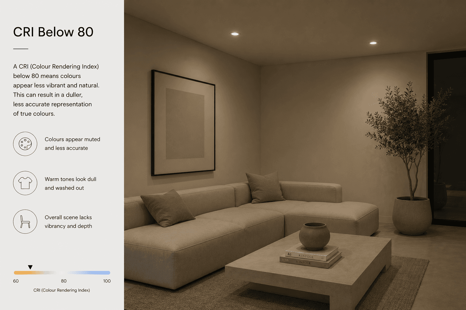
CRI Below 80
Lighting below 80 CRI is generally used in environments where colour accuracy isn’t a priority.
Examples include:
Warehouses
Plant rooms
Storage facilities
Industrial environments
While functional, colours often appear muted and less natural.
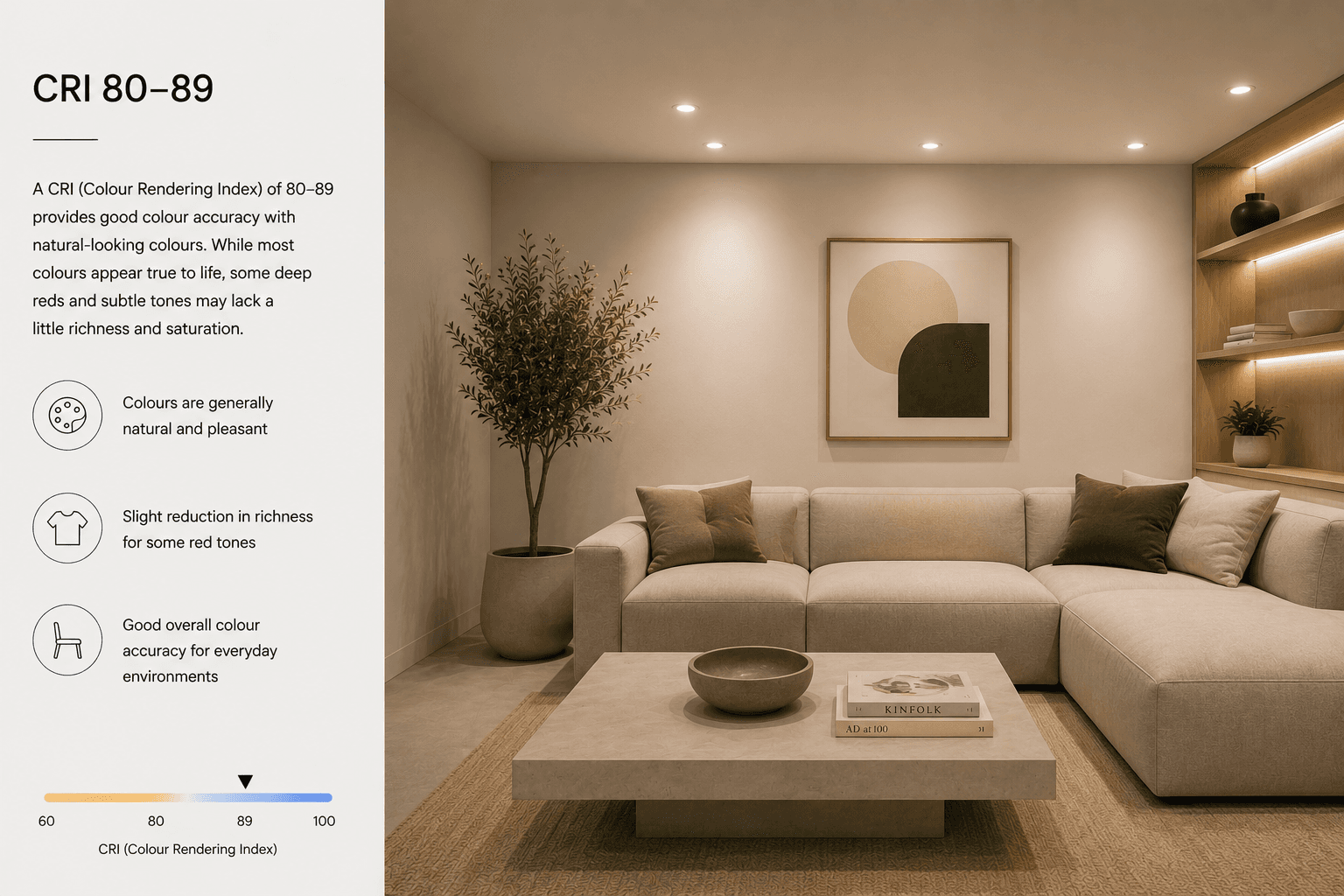
CRI 80–89
This is the minimum standard found in many residential and commercial lighting products.
It provides acceptable colour rendering for general use and is suitable for many everyday applications.
However, subtle colour differences and fine material textures may still be lost.
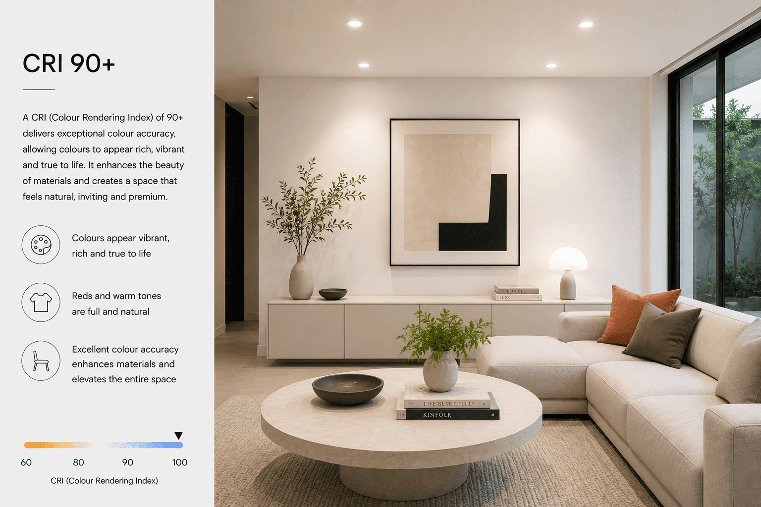
CRI 90+
This is where lighting begins to make a noticeable difference.
A CRI above 90 delivers rich, vibrant and natural colour reproduction, making it ideal for premium residential and commercial spaces.
It’s particularly effective in:
Luxury homes
Kitchens
Living rooms
Bathrooms
Retail stores
Restaurants
Hospitality spaces
Art galleries
At Cobinlight, we often recommend CRI 90 or higher for projects where design quality and visual comfort are priorities.
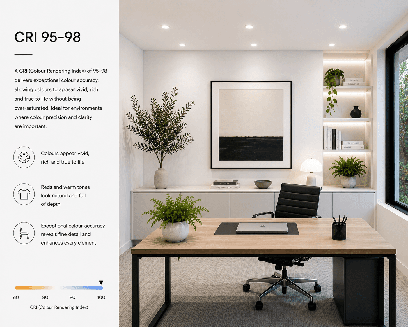
CRI 95–98
This represents exceptional colour rendering.
These luminaires are commonly specified for:
Museums
Art galleries
Photography studios
High-end retail
Luxury residential projects
Materials appear incredibly lifelike, with remarkable depth, richness and clarity.
A Practical Example
Imagine a beautifully designed kitchen featuring natural oak cabinetry, marble worktops and carefully selected paint finishes.
Install lighting with a low CRI, and those materials may appear flat, dull or slightly distorted.
Replace those fittings with high-CRI luminaires, and suddenly the timber gains warmth, the marble reveals its subtle veining and the paint colours appear exactly as they were chosen.
Nothing in the room has changed—only the quality of the light.
CRI and Interior Design
Interior designers spend months selecting colours, fabrics and finishes.
Architects carefully specify natural materials that add texture and character.
Choosing poor-quality lighting can undermine all of those decisions.
High-CRI lighting ensures every design detail is appreciated as intended, allowing architecture and interiors to reach their full potential.
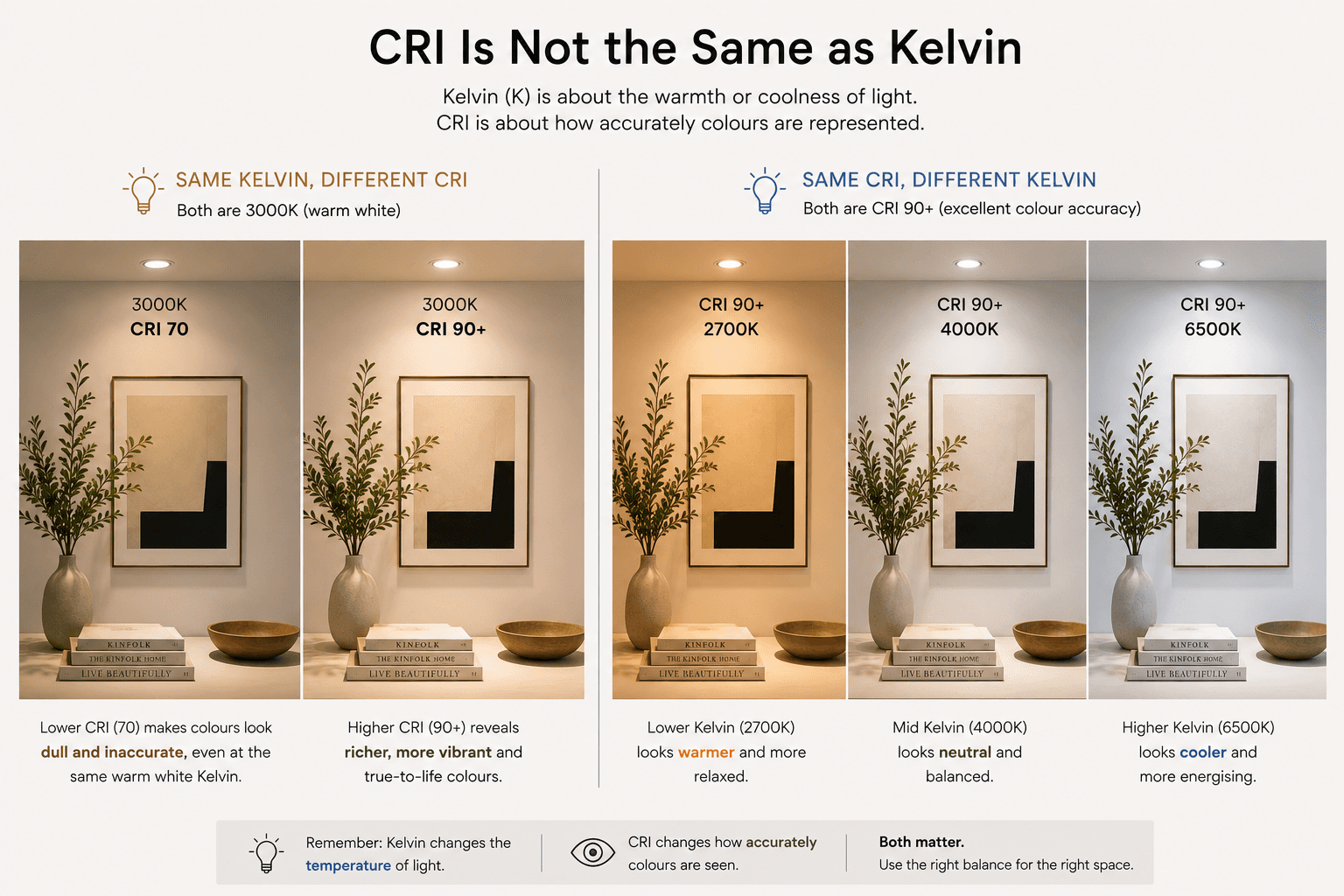
CRI Is Not the Same as Kelvin
One of the biggest misconceptions is confusing CRI with colour temperature.
They measure completely different things.
Kelvin (K) describes the appearance of the light itself.
CRI describes how accurately that light reveals colour.
For example:
A 3000K light with a CRI of 80 and a 3000K light with a CRI of 95 may appear to have the same warm white colour, yet the second will make colours look significantly richer and more natural.
This is why specifying both the correct Kelvin and the correct CRI is essential.
Should Every Home Have High-CRI Lighting?
In our view, yes.
While not every application requires museum-quality colour rendering, specifying CRI 90 or above throughout the main living spaces of a home creates a noticeable improvement in comfort, appearance and overall quality.
It’s a relatively small detail that has a significant impact on how a space is experienced every day.
Better Light Creates Better Spaces
Exceptional lighting isn’t simply about brightness.
It’s about revealing architecture, materials and interiors in their best possible light.
At Cobinlight, we carefully specify luminaires that combine excellent colour rendering, comfortable illumination and timeless design to ensure every project looks just as impressive after sunset as it does during the day.
Because when the light is right, every colour comes to life.